LOOT’s Site Redesigned
I’ve (mostly) finished a new design for LOOT’s website. It’s something that I’ve been wanting to do for a while, but I didn’t have any firm ideas for a new design. The release of the first beta for LOOT v0.7 changed that, as it has an HTML-based user interface, and that made it possible to easily reflect LOOT’s UI in the site design.
LOOT v0.7’s UI is based on Google’s Material Design specification, implemented using the elements provided by Google’s Polymer project. I decided to stick with using Polymer for the site too, as I had already become familiar with it, though this also introduced some problems that I didn’t have to face when using it in a desktop application.
Why Material Design? #
I’m not a designer, so striking out on my own leads to some dubious design choices. By using a specification, I can benefit from the experience of UI designers, and creating a good interface becomes knowing roughly what I want, then doing what I’m told.
Material Design (MD) happens to be the design spec I’ve heard the most about. It’s also pretty thorough, doesn’t hate mouse users (I’m looking at you, Windows 8), and looks good to me, so I didn’t have much reason to look beyond it.
I started out writing LOOT’s HTML user interface from scratch, without following a design spec, and it turned out to be a lot of work, and even more second-guessing my decisions and worrying over the details. I’m glad I made the change.
Polymer: The Cutting Edge #
Polymer provides a set of custom HTML elements, and polyfills the web standards they use. Its ‘paper’ elements use MD, while most of its ‘core’ elements do not. At the time of writing, it’s still in ‘developer preview’, and in practical terms this means:
- the ‘paper’ elements don’t always exactly match the MD spec,
- its performance isn’t great, though this isn’t noticeable if you’re just using a small number of fairly simple elements,
- there are bugs, some of which are fairly obvious.
While in general I like Polymer a lot, I’m not a fan of two things:
Its use of non-standard attributes for styling and data binding, eg.
<paper-input label="Text goes here" floatingLabel>. It is more readable than<paper-input data-label="Text goes here" class="floatingLabel">, and that’s good, but a part of me cringes at such usage when there are perfectly workable standards available.Some of its elements should be practical drop-in replacements for standard elements, but their attributes, events and methods aren’t. For example,
<paper-dropdown-menu>is basically a MD<select>, but it uses theselectedattribute instead ofvalue. Same with<paper-dialog>, which is a MD<dialog>, but usesopenedinstead ofopen, andopen()instead ofshow().It is at least easy enough to wrap these elements in a new custom element that maps their members to the standard ones, but that shouldn’t be necessary. Still, developer preview and all.
One thing to note is that Polymer only supports the latest version of ’evergreen’ browsers, which at time of writing corresponds to ~ 70% of browsers, according to my addition of the statistics on caniuse.com. 70% isn’t great, though feedback suggests that the actual compatibility is much broader, and the percentage will only increase with time. I don’t consider this to be an issue, but it can be a deal-breaker depending on your needs.
Problems, Problems #
By and large, the process of implementing the new design was fairly straightforward, but that’s not interesting, so I’m going to gloss over that and focus on the difficulties.
I had to override the <paper-button> and <paper-item> styling in order to get links in them to take up the full content area of the element: there were already pull requests for these changes (Polymer/paper-item#17 and Polymer/paper-button#38). I also found that the buttons and items would shrink on IE so that they didn’t fit their content, which I fixed with the CSS below.
paper-button::shadow .button-content ::content a,
paper-item::shadow .button-content ::content a {
    /* IE rounds the vanilla flex-basis of 0.000000001px to 0px,
       reset to default value of 'auto' to fix. */
    flex: 1 1 auto;
}
I’ll be sending pull requests for this fix shortly.
I also tripped up on Firefox and Internet Explorer compatibility a few times: they don’t natively support the Shadow DOM at time of writing, so my CSS selectors weren’t matching the element hierarchy in those browsers. To resolve this, I had to make two changes:
- Don’t use the
>or+relationship selectors for elements inside Polymer elements: the DOM for browsers that don’t support Shadow DOM may not match the DOM for browsers that do support it. - Add
shim-shadowdomas a property to any<link>element that loads CSS overrides for Polymer elements.
In general, if your selectors don’t degrade gracefully when pseudo-selectors like ::shadow and ::content are skipped, you can use Polymer’s selector polyfill to provide fallback selectors, but I didn’t need to.
Internet Explorer 11 also claims SVG support, but doesn’t scale SVGs to fit <img> tag sizing, so I had to convert my icon image to a PNG. There are workarounds, but nothing that is suitable for my situation. I had wanted to use the SVG image because it scales well, and forgetting about device pixel ratios meant that I uploaded a 64 x 64 px image for display with a 64 px height. It promptly got scaled on high DPI screens and appeared very blurry, so I replaced it with an image at 256 x 256 px.
Polymer, Jekyll & Vulcanize #
Bower is recommended for managing your Polymer dependencies, and Polymer provides the Vulcanize tool to concatenate them for deployment. This concatenation step is recommended for two reasons:
- Bower downloads a lot more than just the files that are used by your site. The LOOT website’s
bower_componentsfolder size is over 3 MB, but Vulcanize concatenates 800 KB of dependencies. - Each HTML Import sends another HTTP request, which has overhead. Cutting them down to one import reduced my page loading times by 20%.
This means that the bower_components folder and the Vulcanize output file can be added to the repository .gitignore. I find that a useful analogy is like how for a compiled language, you’d commit the source files but not the third-party dependencies (in most cases) or binaries.
However, LOOT’s site is built using Jekyll, which lets me write content in Markdown and use layout templates, among other things. GitHub integrate Jekyll support into their hosting, so you just push the site ‘source’, and they build it. The interplay between this process and Polymer’s isn’t exactly butter-smooth.
For one, Vulcanize doesn’t seem to like Jekyll’s {{ }} tags, so I couldn’t Vulcanize my page template. Instead, I had to put all my HTML imports into another file, Vulcanize that, and import the Vulcanized file into my page template.
This meant that Polymer’s Web Components polyfill had to stay in my page template, because it polyfills the HTML import feature. Since it couldn’t get concatenated in the template, it stays referenced by a <script> tag, pointing to a bower_components subdirectory.
On top of these complications is that I don’t deploy my site as Polymer seems to expect: I push the repository, so it needs to contain the Vulcanized imports file alongside the ‘source’ imports file, and it also needs to contain the Web Components polyfill. The trick to having Git ignore all Bower dependency files except the Web Components polyfill files is to use the following lines in the repository .gitignore:
bower_components/*
!/bower_components/webcomponentsjs/
This gives you a slightly messy repository, but it works, and you don’t need to commit the bulk of the files Bower downloads. On the flip side, Vulcanize must be run whenever the HTML imports are changed. This can be performed manually, or some mechanism such as Git’s post-commit hook can be used to automate it. I tend to use GitHub for Windows for simple commits, and that doesn’t execute Git hooks, so manual it is.
Before and After #
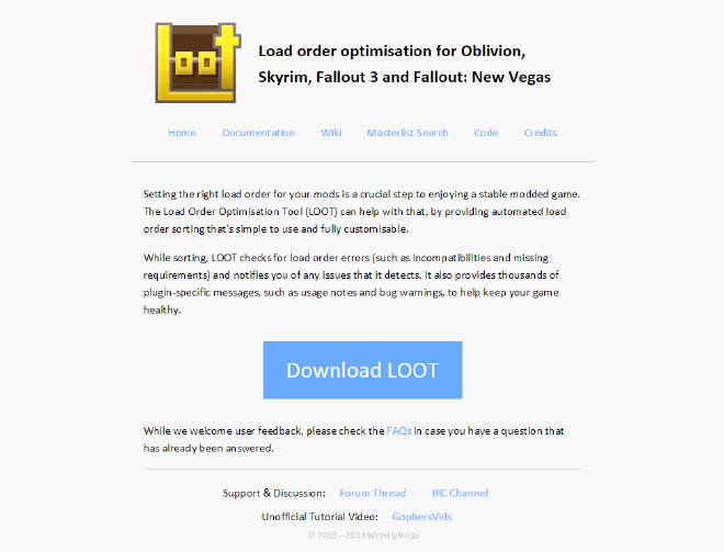
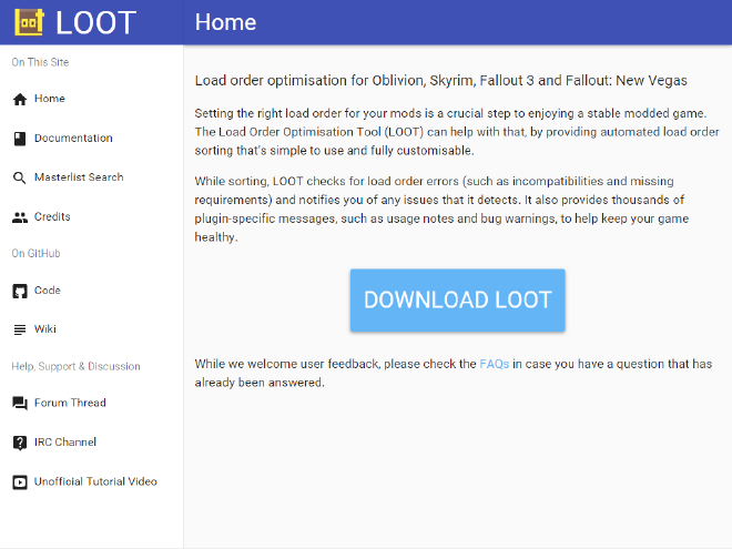
Here are a couple of screenshots in case I’ve since changed the design of the LOOT site again. It’s worth noting that the two site designs took around the same amount of time to implement, and the Polymer-based UI didn’t really draw on that much knowledge I’d picked up on in the intervening time.
Before the redesign…
…and after.
To Be Continued… #
Websites are evolving things, and I’ll continue to tweak LOOT’s.
One specific goal is to achieve full conformance with the Material Design spec, and I’d like to get any necessary changes merged back into Polymer so everyone else can take advantage of them too.